
5 min read
Next.js website optimization: The road to 99% Google PageSpeed
Discover valuable tips to enhance the Google PageSpeed ranking of your publication, built with Next.js using static export.
In today’s fast-paced digital world, website performance is paramount, and achieving a blazingly fast loading time is crucial to engage your audience and improve user experience. Here is my experience of achieving a high ranking on Google PageSpeed
Image optimizations
It’s difficult to imagine a publication without images, and it would be incredibly convenient to automate image optimization to prevent serving large-sized images.
Next-gen formats
The current method to utilize next/image with next export is by employing an external URL from an image provider. This is due to next/image’s default usage of the Node.js server-based image optimization API. There is a big discussion opened on github about this problem.
next/imagedoes not currently perform image optimization during next build, and instead optimizes images on-demand.
Luckily, there is a next-export-optimize-images that addresses this issue for Next.js.
Step 1: Install next-export-optimize-images.
npm install -D next-export-optimize-imagesStep 2: Update next.config.js.
// @ts-check

const { withContentlayer } = require('next-contentlayer');
const withExportImages = require('next-export-optimize-images');

/**
 * @type {import('next').NextConfig}
 **/
const nextConfig = {
  output: 'export',
};

//@ts-ignore
module.exports = withContentlayer(withExportImages(nextConfig));
Step 3: Change build script command in package.json.
{
  //"build": "next build",
  "build": "next build && next-export-optimize-images"
}
Step 4: Create export-images.config.js.
/**
 * @type {import('next-export-optimize-images').Config}
 */
const config = {
  // in my case I want all my images to be converted to webp format.
  // WebP is a modern image format developed by Google, known for its high-quality compression and smaller file sizes
  convertFormat: [['png', 'webp']],
  quality: 60, // default 75 but I didn't notice any differences
};

module.exports = config;
Step 5: Import and use next/image as usual.
import img from './img.png';
<Image src={img} alt="" />;
Use explicit width and height on image elements
Cumulative Layout Shift (CLS) is a metric used to measure the visual stability of a web page during the loading process. It quantifies how much the elements on a page shift or move around as the content loads and changes dynamically.
CLS is important because unexpected layout shifts can lead to a poor user experience, especially when elements move out of place while the user is trying to interact with the page.
That’s why it’s important to set the width and height attributes of the image element. Doing so allows the browser to reserve the appropriate space for the image based on its aspect ratio even before the image is fully loaded, thereby preventing content jumps.
<Image src={img} width="800" height="400" />next-export-optimize-images will use this infromation for generating a set of images for different screens.
Example of generated HTML:
<img
  alt=""
  width="300"
  height="300"
  decoding="async"
  data-nimg="1"
  class="rounded-lg mt-8 sm:mt-0"
  style="color:transparent"
  srcset="
    /_next/static/chunks/images/_next/static/media/kd.b2d93106_384.webp 1x,
    /_next/static/chunks/images/_next/static/media/kd.b2d93106_640.webp 2x
  "
  src="/_next/static/chunks/images/_next/static/media/kd.b2d93106_640.webp"
/>
Images lazy loading
Lazy loading is a web development technique that defers the loading of images until they are about to be seen by the user. It improves page load times and user experience by reducing initial page payload.
Previously, two methods were employed to delay the loading of off-screen images:
- Utilizing the Intersection Observer API.
- Employing scroll, resize, or orientationchange event handlers.
Now, there is a browser-level loading attribute for images that allows us to utilize this feature. next/image uses loading="lazy" by default so nothing to do here.
Largest Contentful Paint (LCP) is a web performance metric that measures how quickly the main content of a webpage is loaded and displayed to users. It’s crucial for a positive user experience.
In my case there were a problem with LCP for my Homepage’s photo image being loading="lazy". So I needed to prioritize the loading of this asset.
<Image
  src={avatar}
  width={300}
  // the image will be considered high priority and preload
  priority={true}
  alt=""
  className="rounded-lg mt-8 sm:mt-0"
/>
P.S. loading="lazy" attribute can be used for iframes (can be useful for YouTube embed videos).
Fonts optimizations
Turned out next.js has it’s own mechanism to add Google Fonts.
Automatically self-host any Google Font. Fonts are included in the deployment and served from the same domain as your deployment. No requests are sent to Google by the browser.
import { Inter } from 'next/font/google'

// If loading a variable font, you don't need to specify the font weight
const inter = Inter({
  subsets: ['latin'],
  display: 'swap',
})

export default function RootLayout({
  children,
}: {
  children: React.ReactNode
}) {
  return (
    <html lang="en" className={inter.className}>
      <body>{children}</body>
    </html>
  )
}
Conclusion
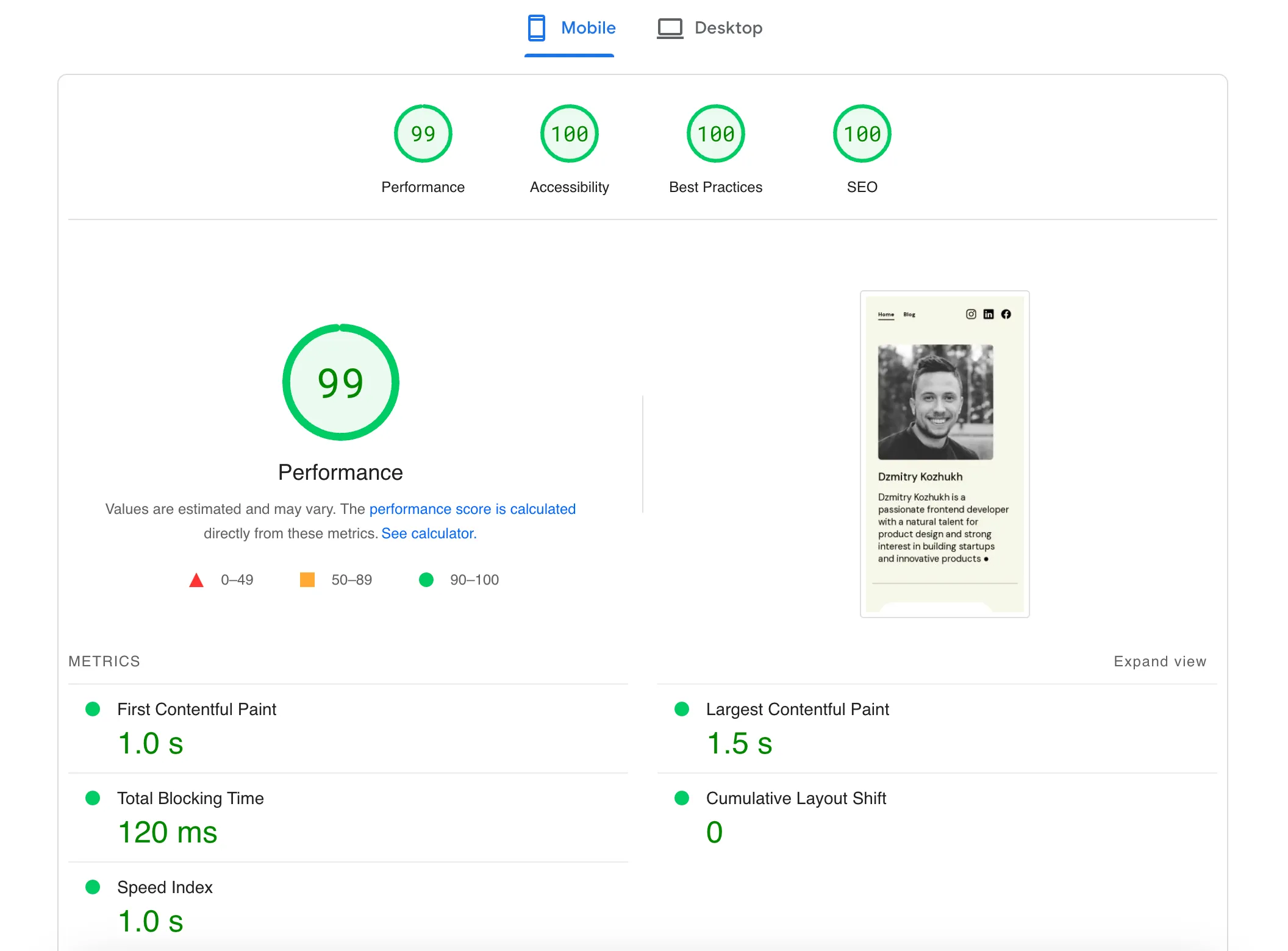
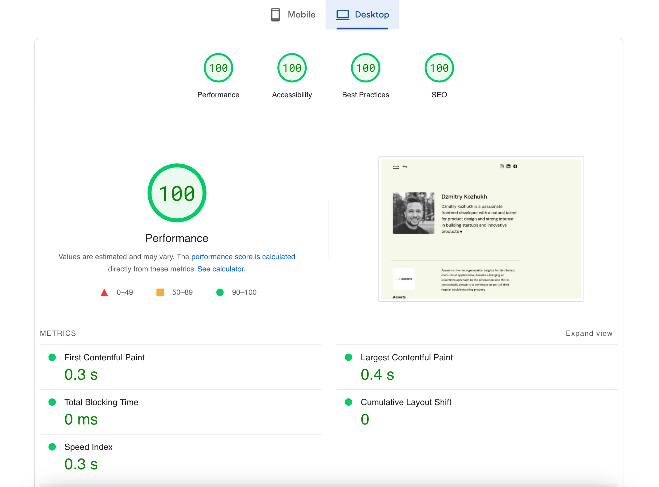
By adhering to the recommendations provided by Google PageSpeed, I have successfully achieved high scores on my web pages. Here are some examples of the results I obtained through these optimizations:
In conclusion, page speed loading plays a critical role in enhancing user experience, user engagement, and overall website performance. Users expect fast-loading pages, and a slow website can lead to high bounce rates and lost opportunities. Google PageSpeed Insights is a valuable tool that offers data-driven recommendations to optimize website speed and performance.